
CASE STUDY
CSS LAB: JW FOLIO
UPDATED 11/30/2018 (work-in-progress)
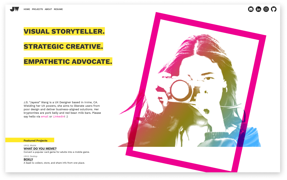
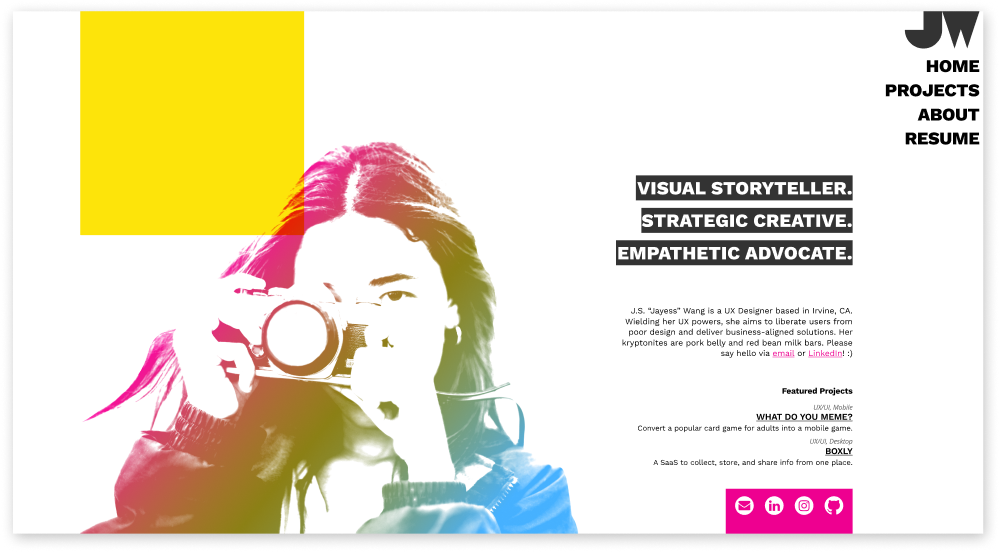
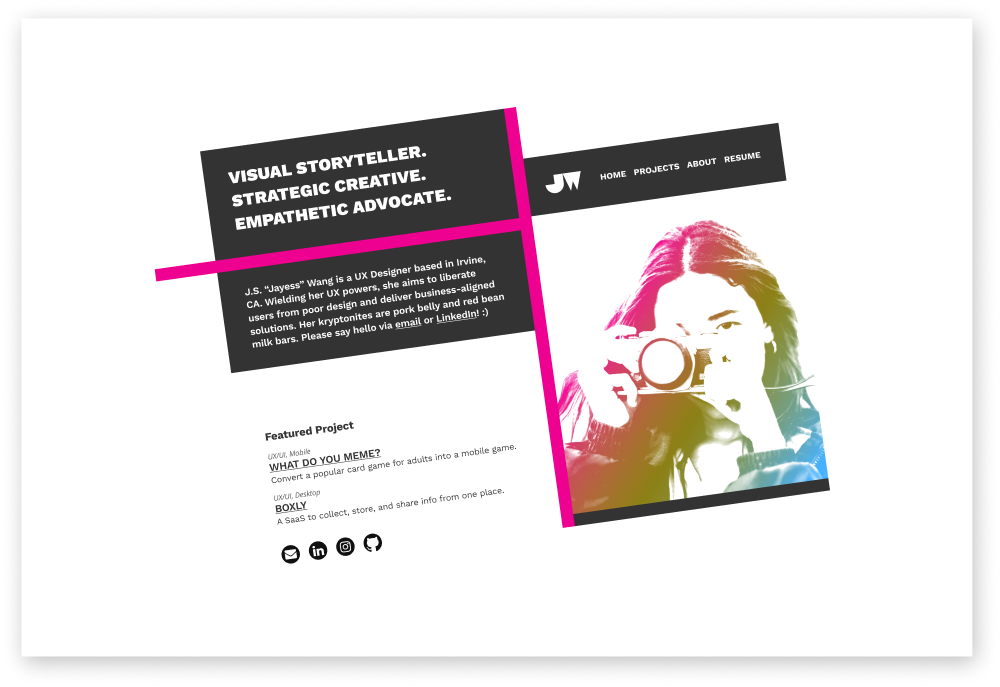
Inspired by Lynn Fisher's work, I'm experimenting with CSS Grid & Flexbox to showcase different homepage layouts as users resize their browser. You can view all ten of my layouts in Figma.
INTRODUCTION
If you were asked to complete the following analogy, how would you answer?
Architect is to engineer,
as web designer is to ___________.
If you responded with "web developer" (or anything similar), then you understand that these pairings describe the relationship between one who creates a blueprint and one who transforms that blueprint into a tangible final product.
ABOUT THIS PROJECT
Recently, I discovered a series of YouTube videos by Google Chrome Developers titled, “Designers vs. Developers.” In each episode, the hosts discuss common industry pain points by opening a conversation between the two sides, providing takeaways, solutions to workflows, tools, and discussions on everyday struggles.
With these insights into the importance and difficulties in the designer/developer relationship, I felt intrigued to study the development process in converting mockups into a functional website. Inspired to level up my ability to empathize and communicate with others, I challenged myself to (literally!) step into a developer's shoes by hand coding a responsive website of my portfolio from scratch and hosting it on GitHub.
I’m always open to growing as a designer, so this project gave me the opportunity to try something new, test out ideas, and expand my range of skills.
TECHNICAL INSIGHTS
Starting with the basics, I studied in-depth how the CSS box model works; essentially, it is a box that wraps around every HTML element and consists of margins, borders, padding, and the actual content.
I enjoyed reading about the history of HTML/CSS and felt incredible relief to discover CSS Grid and Flexbox, which allows developers an unprecedented level of control. I was amazed to learn of the coding acrobatics developers performed in the past just to create the proper website layout!
The HTML below showcases one example of how I applied the box model to create a centered and fixed navigation bar:
<nav>
  <div class="nav-wrapper">
    <a href="#"></a>
    <menu>
      <a href="#">HOME</a>
      <a href="#">PROJECTS</a>
      <a href="#">ABOUT</a>
    </menu>
  </div>
</nav>
The CSS below showcases how I styled the HTML:
.nav {
  height: 40px;
  width: 100%;
  position: fixed;
  top: 0;
  left: 0;
  display: flex;
  justify-content: center;
  align-items: center;
  z-index: 2;
}
.nav-wrapper {
  max-width: 1280px;
  width: 100%;
  background-color: #303030;
  opacity: 0.97;
  display: flex;
  justify-content: space-between;
}
If you resize your browser window and scroll down, you'll notice how the navigation bar remains visible and centered. (You get double brownie points if you also observed that the code snippets above are responsive.)
Although I'm unable to cover all the topics I studied, as there were just too many, here are some of the major concepts I examined:
- Semantic HTML
- The nuances between various CSS properties in terms of their similarities and differences (e.g.
display:nonevs.visibility:hidden) - The argument for using CSS grid and flexbox vs. frameworks, such as Bootstrap
- The hierarchy of the DOM tree
- The order in which a browser parses code and renders content in the browser window
- When to use CSS vs. JavaScript to build interactive features (simple vs. complex)
- How skeleton screens (designing latency stages) improve perceived performance
- The schools of thought between graceful degradation vs. progressive enhancement
- And many more...
As I underwent this learning process, I strengthened my ability to find answers quickly and independently. I also grew in my appreciation for and ability to empathize with a developer’s unique perspective, priorities, and challenges in responsive web development. For example, just the other day, when I read the following excerpt:
"In its infancy, [Instagram] was too computationally expensive to allow for both landscape and portrait mode; instead of limiting the interface to one or the other, Instagram’s designers decided to make every photo a square. By being square, you didn’t have to choose anymore. It was a great design decision."
~John Maeda, Wired Magazine
I realized that development-related concerns had become easier for me to understand and anticipate, which translates into a productive, enjoyable, and expedient collaboration with developers.
WHAT I LEARNED
When it comes to balancing the "art" and "science" of UX design, Susan Stuart says it best:
"A UX Designer must have enough technical knowledge to realistically design for the possibilities and limitations of a platform, and knowledge of some scientific principles of how computer interfaces can affect the brain."
~Susan Stuart, Medium
The more I coded, the more comfortable I became around code. Gone were the days when merely *looking* at an HTML or CSS document was enough to overwhelm me. (Well... maybe it still overwhelms me a little, especially JavaScript!) Interestingly, I recently read that research into foreign language speakers shows there are numerous benefits in bilingualism, especially in how it improves a person's ability to adapt to change, feel empathy towards others, and creatively solve problems.
I experienced a similar feeling when switching between designing and coding, like a different part of my brain had been activated and an unexpected creative perspective emerged; the kind where I had the imagination and vision to see alternate approaches and results.
With this new insight, my world as a designer has become even bigger with unbridled opportunities and greater possibilities. This experience inspires me to continue seeking interesting personal projects and fun experiments in coding. As they say, the sky's the limit.