CASE STUDY

WHAT DO YOU MEME?TM MOBILE GAME

ABOUT THIS PROJECT

PROBLEM: Create a proof of concept for converting a popular tabletop game for adults, What Do You Meme?™ (WDYM), into a mobile game.


SOLUTION: Keep only the top three game mechanics and "translate" all others to fit within a mobile format by taking advantage of its native strengths (e.g. automation).


RESULT: The interactive prototype MVP that I presented to the stakeholders gave them the ability to experience the mobile game as a brief tutorial.


MY ROLE: User Research, UX/UI, and Usability Testing on a solo capstone project.


MY TOOLS: Figma, Axure, UsabilityHub.com, Google Forms, Loom, YouTube.

SNAPSHOT OF ITERATIONS

Sketch #1

wireframe of launch screen

Sketch #2

wireframe of profile page

Wireframe #1

wireframe of settings window

Wireframe #2

wireframe of new cards

Mockup #1

wireframe of player's hand of cards

Mockup #2

wireframe for selecting a caption card

SUMMARY

The stakeholders asked the following questions: What would the mobile version of WDYM tabletop game look like? To what extent would it be possibile to preserve and incorporate all of its original game mechanics? Would a mobile game be appealing to their customers? They expected to use the results of this study to determine the amount of human and financial capital they would need to invest in order to build this product and the feasibility of this project.

It was important to the stakeholders that their users experienced familiarity and a seamless transition in going from one format to the other. Based on design research and user tested results, I created a data-driven blueprint for building WDYM mobile game. In general, I was able to stay true to the original tabletop game and also introduced a few new features, such as a timer and a status update window, which allowed me to “translate” certain gameplay experiences into a better fit for the mobile game format.

RESEARCH


what do you meme card game

If you look into some of today’s most popular tabletop games — with classics, such as Monopoly and Clue, or modern favorites, such as Cards Against Humanity, Settlers of Catan, and Ticket to Ride — you would easily find a mobile version of these games. According to research firm, NewZoo, smartphone and tablet game revenues accounted for 42% of the global games market in 2017 and projected trends show steady and continued growth over the next three years. Based on these figures, there is great opportunity for reaching a wider audience, especially given today's lifestyle where we have a close relationship with technology and depend so much on our mobile devices.

GLOBAL GAMES MARKET

chart of 2016-2020 global games market

RANKINGS & ANALYTICS

FIELD STUDY

SURVEY RESULTS

HABITS OF MOBILE GAME USERS

240%

MORE top 100 ranked tabletop games on Android than iOS

25%

play mobile games everyday

67%

play mobile games 1-2x or more per week

58%

play mobile games 4-6hrs or more per month

50%

would download a mobile app that is popular in general or among their friends

*click here for links to all user survey results

COMPETITIVE ANALYSIS

Based on the data I collected, I mapped out some of the differences in user experience between tabletop and mobile games. The chart below illustrates some of my key findings.

TABLETOP GAMES

  • Face-to-face human interaction
  • Tactile feel of game board and pieces
  • Physical actions of moving game pieces, writing notes and points, shuffling cards
  • Long instruction manuals for complex games
  • Longer game sessions (over many hours)
  • Can be bought in stores or online

MOBILE GAMES

  • Play with anyone, anywhere in the world
  • No wear ‘n tear or missing game pieces
  • Automation of tracking, player order, actions, points, cards, and game pieces
  • Computer guided practice game or tutorial
  • Shorter game sessions (until battery dies)
  • Can download and play immediately

PERSONAS

Once I had compiled all the collected data, I created three personas to represent the most common types of users I discovered.

USER FLOWS

STORYBOARDING

With each iteration of sketches, the user experience and layout of features began to take more shape and form, as old questions were answered and new questions came up.

For example, where should the card decks go? Where should the avatars be placed? How large or small should we make the profile image? How would player’s differentiate between the judge’s deck or the player’s deck of cards? How would players keep track of the score? How would players get prompted and reminded when it’s his or her turn to be the judge?

Once I had fleshed out my storyboards, I created wireframes based on the ideas that aligned the closest with the stakeholders' goals.

WIREFRAMES

Menu

wireframe of launch screen

Profile

wireframe of profile page

New Cards

wireframe of new cards

Submit a Caption Card

wireframe for selecting a caption card

STYLE GUIDE

The stakeholders emphasized that creating a functional and usable MVP was the highest priority. Also, the stakeholders asked that I adhere to the original branding and visual style of WDYM.

I began by curating a moodboard of popular memes and images from the WDYM website.


For type, I chose Helvetica, which is used in the WDYM Caption Cards, and Impact, which is considered the defacto meme font. For the color palette, I sampled colors from the WDYM logo. I also created a pattern library of components that were used to build the mobile app, which allowed me to maintain consistency among all elements.

COLOR PALETTE

#27C7CA

#A7459A

#FFE231

#332F79

#666666

#DADADA

TYPOGRAPHY
IMPACT 22pt.
ABCDEFGHIJKLMNOPQRSTUVWXYZ

HELVETICA 18pt.

ABCDEFGHIJKLMNOPQRSTUVWXYZ
abcdefghijklmnopqrstuvwxyz

USABILITY TESTING

I engaged in rapid prototyping and iterated constantly as I built the prototype from wireframes to mockups, testing each design frequently and applying user feedback quickly.

Using Google Hangouts and screen sharing, I followed a usability test script and remotely observed three users in real-time as they navigated through the prototype and completed a series of assigned tasks. Afterward, I compiled their comments and feedback into a Google Doc.

In total, I cycled through roughly four iterations of prototypes and testing before arriving at the final deliverable.


1st Draft

Final Prototype

RAPID PROTOTYPING

Here are some examples of how the mobile game features evolved through the design, testing, and iteration process:

BACKGROUND: I combined some ideas from the moodboard in various ways and conducted A/B testing. Based on users’ responses, I created the final version of the mobile game’s background. [Background A/B Test]

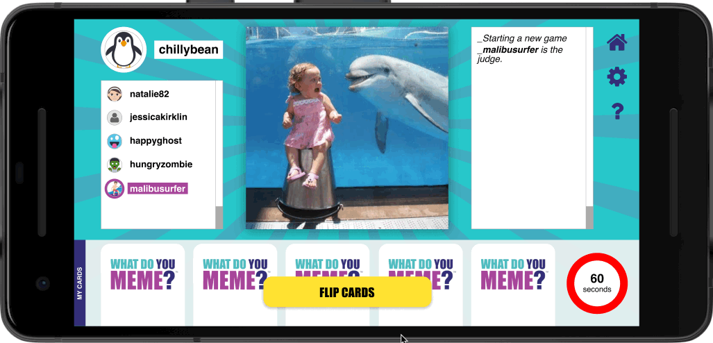
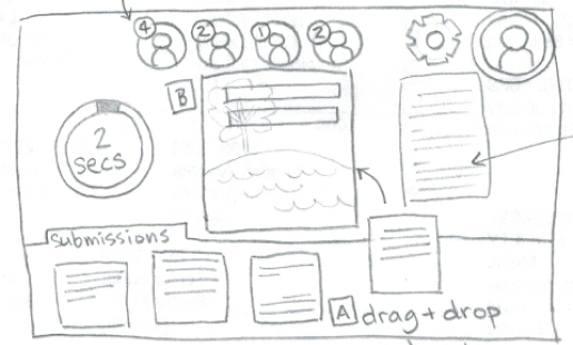
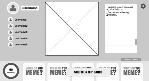
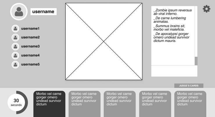
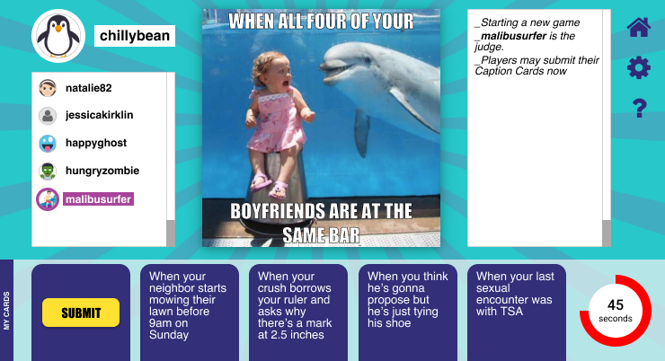
BUTTONS: In the sketches, I initially started with a “drag + drop” feature for users to submit their Caption Card and draw new Caption Cards from the card deck. I choose this feature at first because of the trend in adding more interactivity and "bells and whistles" to digital products. However, when I noticed that users in the 50+ years age demographic tested negatively for this features, I had to rethink my decision. They complained that their thumbs obstructed their view, which increased their annoyance and reduced the joy they felt for the mobile game. In the end, I decided to use buttons because it was more widely accepted and brought a higher value to the most number of users.

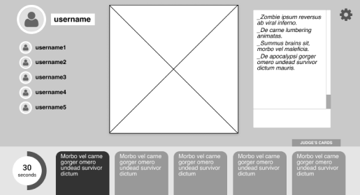
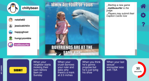
CAPTIONS: I designed the Caption Cards to overlay their caption on the Photo Card for a few reasons. Given that the mobile game format lives in the digital world, I wanted to replicate the experience of creating a meme, exactly as you would in real life. Also, given the wide age demographic of our users, I felt that seniors would likely have more difficulty reading the small print on the Caption Cards and would appreciate the caption displayed in a larger font over a Photo Card. Although some users commented that this feature confused them a little at the beginning of the tutorial, this same group did not express any frustration and remarked that they easily figured out what was happening.

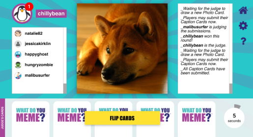
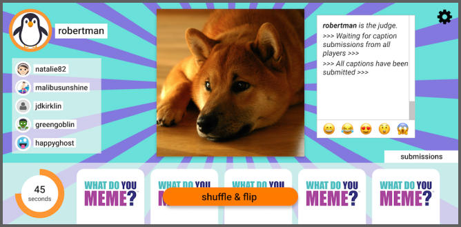
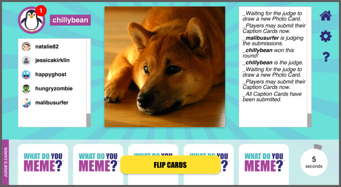
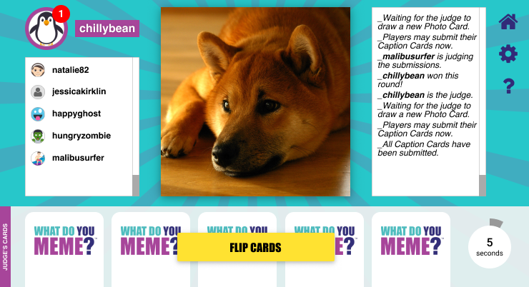
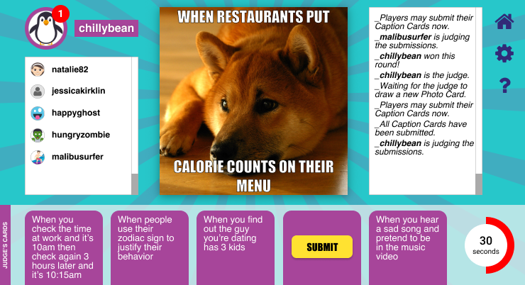
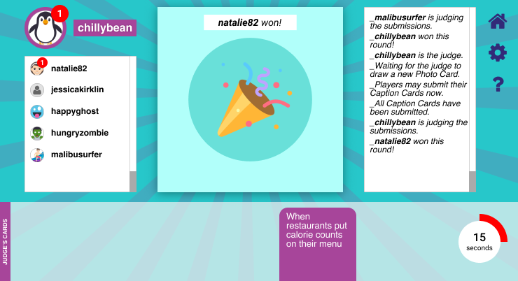
GAME STATUS: In any tabletop game, there’s always a person that keeps track of the game status, whose turn it is, and what actions need to happen next. I was able to solve that problem by introducing a status window that prompts all the players of the next action. Initially, I added an input field of emojis to allow players to like or respond to a caption. However, during user testing, I discovered that all of our users disliked this feature, citing that it was confusing or that they probably wouldn’t use it (in its current form). As a result, I removed the feature because it was unnecessary in an MVP and tabled it as a future option to revisit.

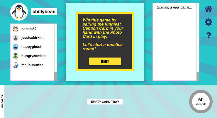
TUTORIAL: I tested the tutorial script and colored text bubbles until I achieved a good balance of brevity and depth that would not bore current fans or confuse new fans. [Preference Test #1 | Preference Test #2]

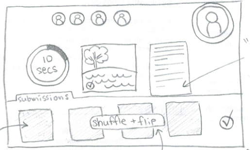
TIMER: In Exploding Kittens mobile game, there was a gauge that moved based on a player’s likelihood of drawing the exploding kitten card (players avoided this card at all cost). This feature inspired me to introduce a timer to WDYM mobile game. With a timer, the mobile game created a greater sense of urgency, allowing players to experience the energetic pace of the tabletop game. Without the timer, I noticed that the players and judges took much longer to read and submit their Caption Cards. Once I added a timer, the users commented that they felt less distracted and more engaged in playing WDYM mobile game. The users differed in their preference of a countdown that ranged from 30- to 90-seconds. I took the average of both extremes and settled on a sweet spot of a 60-seconds timer.

VIEW PROTOTYPE meme mobile game submit screen

MOCKUPS

Change Avatar

Start Tutorial

Read a Caption Card

Cards Submitted to Judge

Judge Reads Caption Cards

Judge Selects a Winner

WHAT I LEARNED

Throughout the design process, I realized that many of the game mechanics in a tabletop game could not simply be converted directly into a mobile game. As I observed users in field studies, mapped out the similarities and differences in the tabletop and mobile versions of three test games, and sketched out various user flows and stories, it became clear to me that I had to think outside the box and find ways to "translate", not "convert", the experience.

As I brainstormed and sketched ideas, I realized that some game mechanics were more important to preserve than others. Based on this insight, I listed all the game mechanics in WDYM (tabletop version) and narrowed them down to the three most important ones:


  1. Each player always had a deck of five caption cards in hand and would submit a card to pair with the photo card,
  2. Each player would take a turn being the judge and choosing a winning caption, and
  3. Once all the players had served as the judge, the round would end and a new round would begin.

This framework ensured that I would be mindful of the "big picture" and stay on course to meet the most important goal for the stakeholders - that users would experience a seamless transition between the tabletop and mobile versions of WDYM. By highlighting these rules, I created constraints that channeled my creativity to innovate and offer alternative solutions in a productive and relevant way.

I learned that the process of rapid prototyping, with frequent testing and constant iteration, ensured that I focused my time and efforts on building only the most neccessary and successful features and eliminating all the ineffective ones, even when the feedback surprised me. Most importantly, as I collected more data, I became more confident in advocating for certain design choices that may not seem "popular," "trendy," or "cool."

In the end, I not only felt more emboldened to advocate on behalf of users, but also had the data and numbers to persuade C-level decision makers to greenlight the development phase of this project.

Wanna connect?

I'd love to hear from you! To get in touch, please e-mail me or say hello on LinkedIn. Also, please feel free to download my resume.

More Projects

Case Study

Boxly

Visual Design • UI/UX • Testing

Case Study

What Do You Meme?
Mobile Game

User Research • UX/UI • Testing

Project

CSS LAB: JW FOLIO

Responsive Design • Frontend

Project

Daily UI

Design Patterns • Psychology

Collection

Untitled 2013-2018

Fashion Photography

Coming Soon!