CASE STUDY

BOXLY

ABOUT THIS PROJECT


PROBLEM: Users find it difficult to collect, store, and share information all in one place.

SOLUTION: Curate the best features of competitors and combine them into one product.

RESULT: Users enjoyed the simplicity and capability of the MVP to organize & manage their information and suggested features for future releases.

MY ROLE: Visual Design, Info Arch (e.g. user flows, wireframes), Usability Testing.

MY TOOLS: Sketch, InVision, Figma, UserTesting.com, G-Suite (Forms, Sheet), Axure, Balsamiq.

SUMMARY

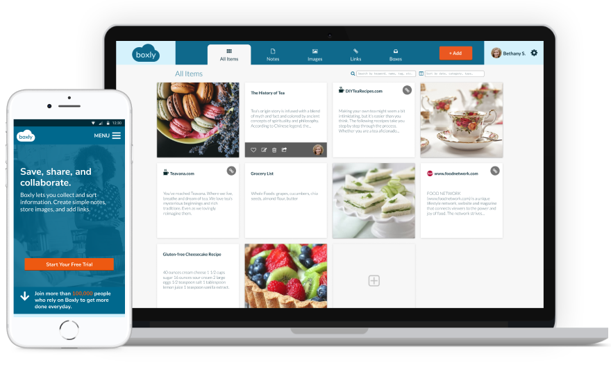
Boxly is a SaaS (Software as a Service) web application which allows people to collect information, store it in a single place, and collaborate with others. A person can create simple documents, store images, links to websites, and collaborate with others.

I needed to know what features to put in Boxly and how to position it in the market so that it stands out and provides a unique service that the market is currently lacking. I wanted to discover what features were neccessary in our app at the MVP level. I also wanted to discover what features were the most relevant to each different demographic, and on which specific demographic to focus our efforts and resources.

It was important to research users and discover the kinds of features that succeeded with people and what features (or lack of features) created pain points in the average user and to what degree these pain points influenced the users’ likelihood to continue or discontinue using the product. I was also interested in discovering to what extent the product’s UI and layout affected a user’s experience of the product and what degree of inconvenience a user was willing to put up with before leaving the product. I was also interested in determining the target market demographic I would be aiming for in developing Boxly.

USER RESEARCH

I divided my survey into the following sections:


  1. General questions regarding users’ electronic tools and online habits
  2. How they save content and write notes
  3. The types of interactions they had in their work environment
  4. To what extent they used social media to sign onto other websites
  5. Demographic/background info to better understand who are users are

SURVEY RESULTS

DAILY HABITS OF USERS

100%

Prefer to browse online on a desktop/laptop vs. smartphone (57%)

100%

Enjoy sharing resources often (57%) or sometime (43%) with colleagues

87%

Have either a Facebook or Twitter account

86%

Work in a collaborative environment

COMPETITORS

Boxly aims to provide a product that solves some of the pain points suffered by users of Dropbox, Google Docs, Evernote, and Pinterest, especially when it comes to easy, intuitive, and effective collaboration among team members. I strived to create a product that effectively merges the collaborative features of Google Docs with the aesthetics of Dropbox Paper, the storyboard layout of Pinterest, and the organizational capability of Evernote (e.g. scanning an image of a receipt and converting it into text, tagging notes and articles into labels/folders for quick retrieval).

PERSONAS

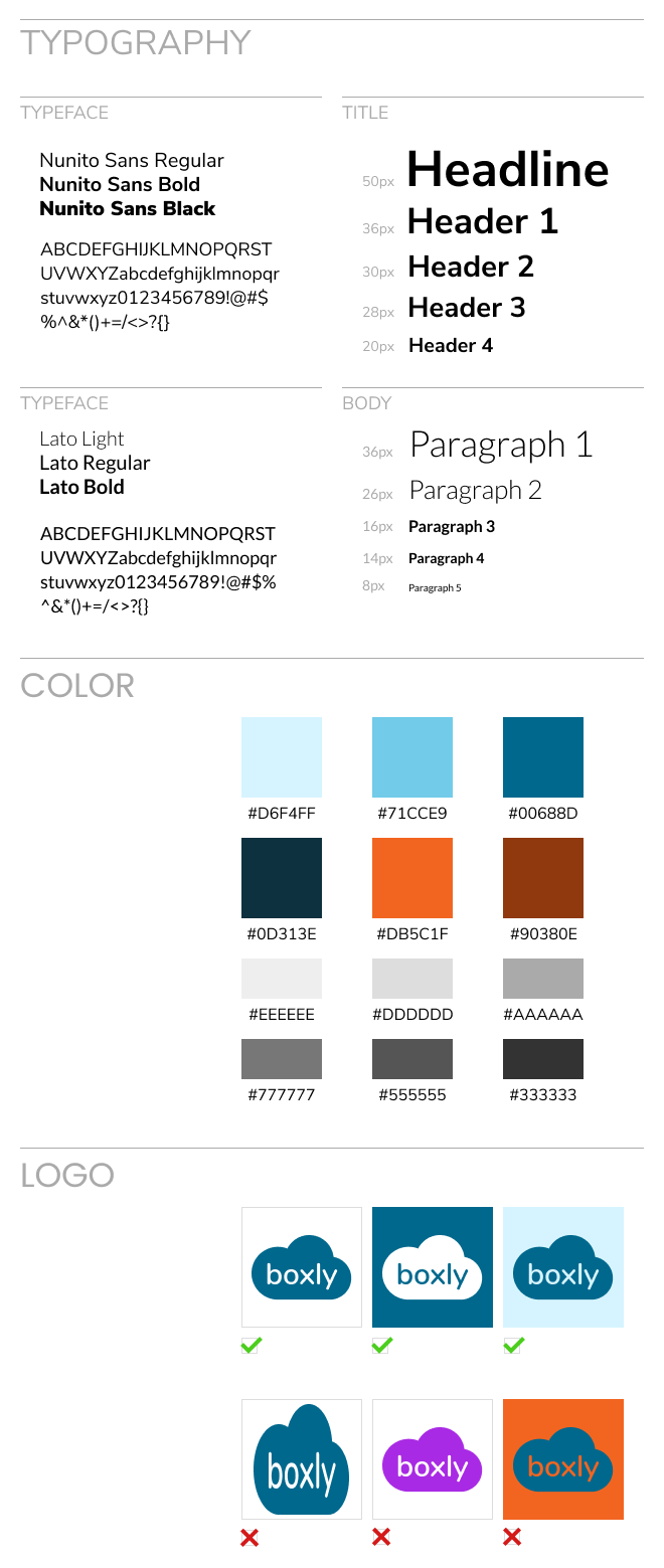
STYLE GUIDE

style guide

INFORMATION ARCHITECTURE

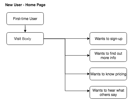
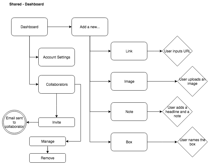
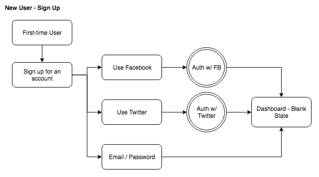
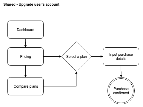
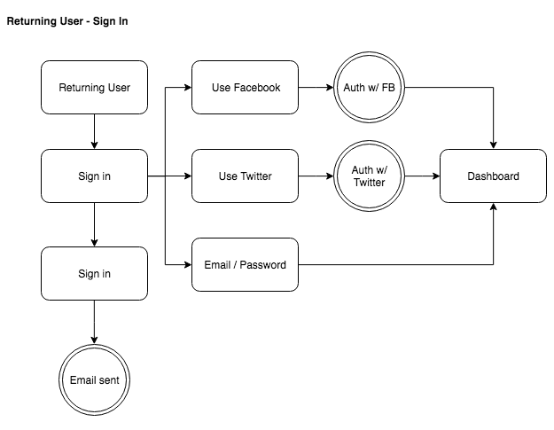
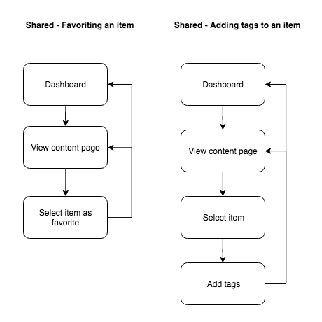
Using a whiteboard, I mapped out user stories and user flows that helped me build a framework of users' needs that I could apply to the wireframes and mockups.

USER FLOWS

WIREFRAMES

Based on the information architecture I mapped out, I created three wireframes with different layouts. I decided that Sections 1 & 2 (in red below) were the layouts I liked the best.

USABILITY TESTING

Using UserTesting, I tested a wireframe of the homepage and mockups of the dashboard. Based on these responses, I made adjustments, such as changing button sizes, and moving the navigation bar and breadcrumb menu. Below are the questions I asked.


WIREFRAME - TEST PLAN


Introduction

Please note that for this test, you’ll be using a prototype, not a finished product. Some features may be missing or unresponsive. If something doesn’t work as expected, tell us what you think should happen.


Tasks

  1. Look around and talk about what you think this is about. What can you do here, what's it for, what strikes you about it?
  2. Think of something you might want to do here. Try and do that thing.
  3. What, if anything, do you like or dislike?
  4. Since this isn’t a finished design, what would you like to see in the final version?


MOCKUPS - TEST PLAN


Introduction

Imagine you want to save inspiring things you find online.


Tasks

  1. Without leaving this page, in your own words, describe what do you think you can do on this [WEBSITE, PAGE, SECTION]? Be specific.
  2. Do you trust this company? Do they look reliable? [Verbal Response]
  3. Is there any information on this page that you think is missing? [Verbal Response]
  4. You're a new user of Boxly. Sign in and access your dashboard.
  5. Change your user settings.
  6. Add a piece of content.

Questions

  1. What frustrated you most about this site?
  2. If you had a magic wand, how would you improve this site?
  3. What did you like about the site?
  4. How likely are you to recommend this site to a friend or colleague (0=Not at all likely, and 10=Very Likely)?

Wanna connect?

I'd love to hear from you! To get in touch, please e-mail me or say hello on LinkedIn. Also, please feel free to download my resume.

More Projects

Case Study

Boxly

Visual Design • UI/UX • Testing

Case Study

What Do You Meme?
Mobile Game

User Research • UX/UI • Testing

Project

CSS LAB: JW FOLIO

Responsive Design • Frontend

Project

Daily UI

Design Patterns • Psychology

Collection

Untitled 2013-2018

Fashion Photography

Coming Soon!