A daily design project over the next 100 days, where I will create and use wireframes to explore key design patterns and psychological principles.
Since the daily prompts serve mainly as inspiration, I will take the artistic liberty of completing them in the order I choose and may even "stretch" a prompt in a different direction if it helps me achieve my primary goal.
If you are inspired to start this challenge yourself, please visit Daily UI to sign up for their daily prompts. Also, you can comment and follow my results on Twitter and/or LinkedIn.
Now, onward! :)
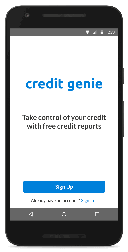
Day #001: Sign Up
DESIGN PATTERN /// Input Feedback
GOAL /// To give users real-time feedback regarding the status of their inputs and actions. This technique reduces a user's confusion and/or frustration when completing a tedious, detail-oriented task.
View Prototype
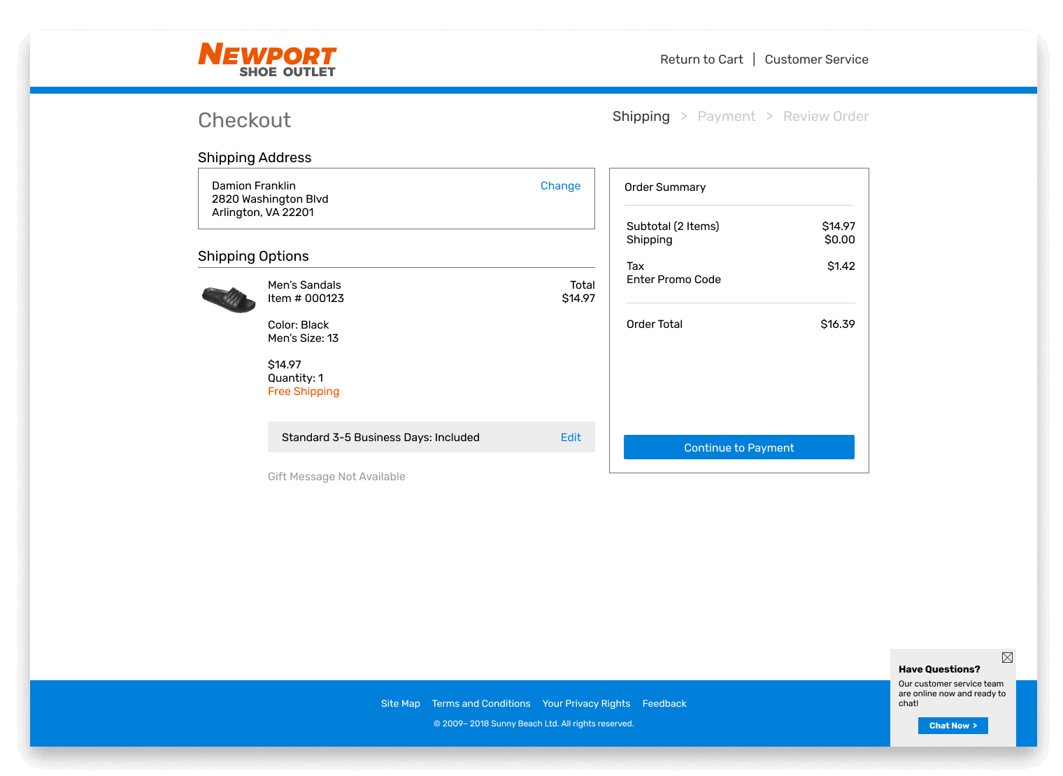
Day #002: Credit Card Checkout
DESIGN PATTERN /// (1) Breadcrumbs / (2) Tunneling
GOAL /// (1) To show users their location within the website, and (2) to guide them through a process without distraction. These techniques give the user a sense of control over their navigation and helps them focus on the task at hand.
View Prototype
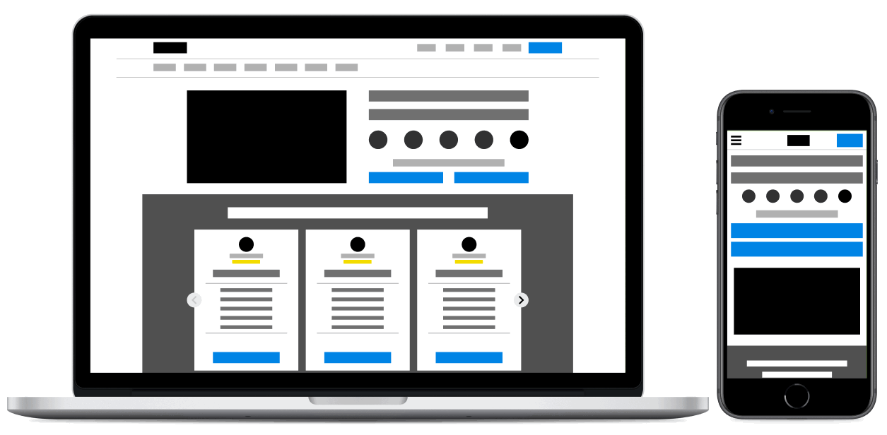
Day #003: Landing Page
DESIGN PATTERN /// Call-to-Action
GOAL /// To clearly present the next step and encourage users to move down the sales funnel. In the example below, I've applied a few principles of visual hierarchy – as in, color, space, contrast, alignment, etc. – to make the call-to-action buttons stand out and draw the user's attention.
NOTE /// First introduced by Luke Wroblewski in 2013 while at Polar, skeleton screens signify a change in state and increase a user's perceived performance of a website when they are quickly loaded first. This technique is one of many that improves the user experience when there is a wait time.
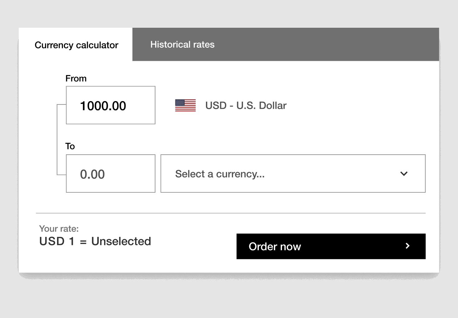
Day #004: Calculator
DESIGN PATTERN /// Vertical Dropdown Menu
GOAL /// To give users access to deeper levels of navigation without cluttering the screen. In accordance to Hick's Law, this technique reduces cognitive load by presenting users with a large amount of data in an easy-to-digest form.
In this example, I've placed the most popular currencies at the top of the list with all others following in alphabetical order. With this design choice, I not only show respect for the user's time, but also increase their efficiency in completing their task.
NOTE /// While drop-down menus are useful, be mindful of the fact that they are not search engine friendly when built purely with JavaScript, and therefore, will not be indexed.
View Prototype
Day #005: App Icon
DESIGN PRINCIPLE /// Color Theory / Lighting
GOAL /// To emulate how natural light illuminates a 3D object and creates dimension. I added a background gradient to increase the contrast of light pink against a darker blue and vice versa.
NOTE /// Interestingly, the word photography literally means "to paint with light" in Greek. As a former fashion photographer with over a decade of experience, I have been a "chaser of light" for years and often draw on this expertise to inform my design thinking and collaborative process.
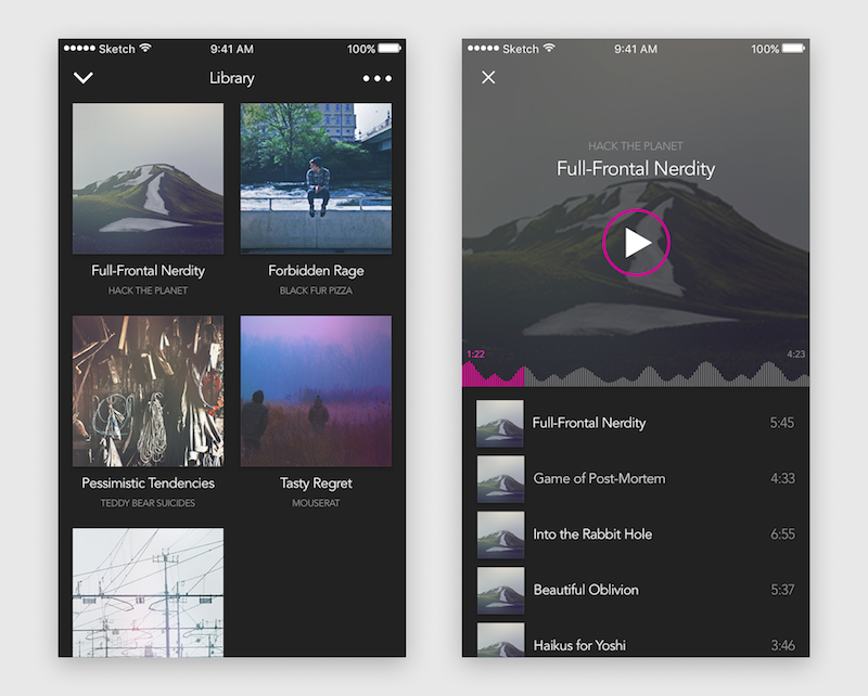
Day #009: Music Player
DESIGN PATTERN /// Springboard
GOAL /// To provide users with an overview of their app content.
NOTE /// While this UI pattern allows users to have quick, direct access to a specific group of content, the reduced screen real estate of a mobile device will limit how many apps the user may view at any given time. Consequently, this UI pattern is most suited for content-focused navigation.